


UMAMI
Umami is possibly the most loved local pizza delivery. It focuses on making top quality dough, using premium italian ingredients combined with natural local products.
The problem:
Established in 2012, the brand was in need of a new visual identity in order to better represent the company and its beliefs-only using premium italian ingredients and natural products, following a strict napoletan recipe.
Since it's opening, the market became oversatured with the classic "Napoletan" look, making it extremly difficult to stand out and be recognized as a leader in premium pizza and premium italian food.
The solution:
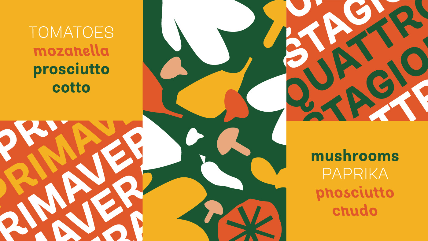
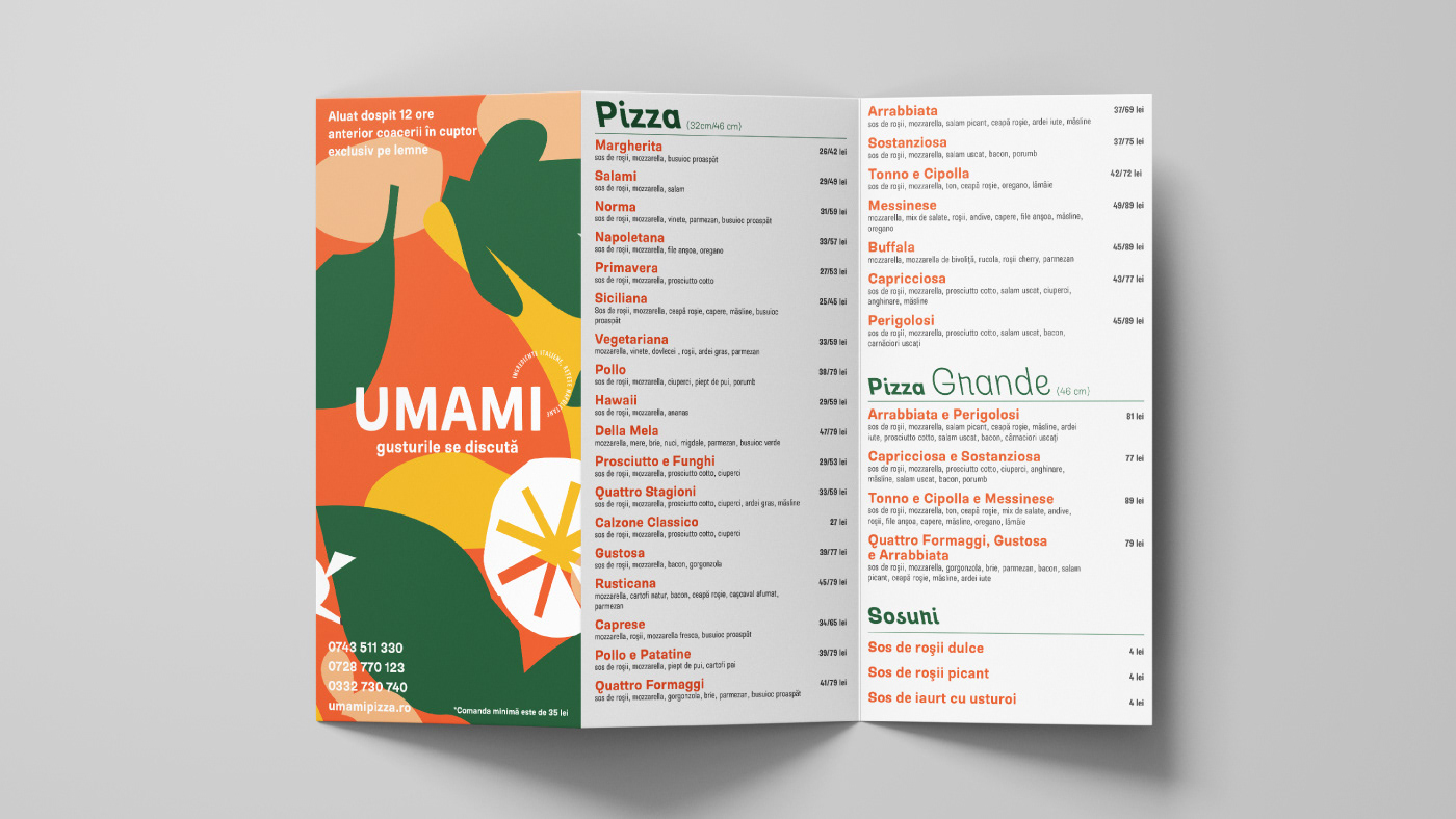
The thought was to start from the basics - the ingredients. Focusing on them to have a rough look in order to show that nature has beauty in its imperfections, that all the ingredients are natural and come from trusted sources.
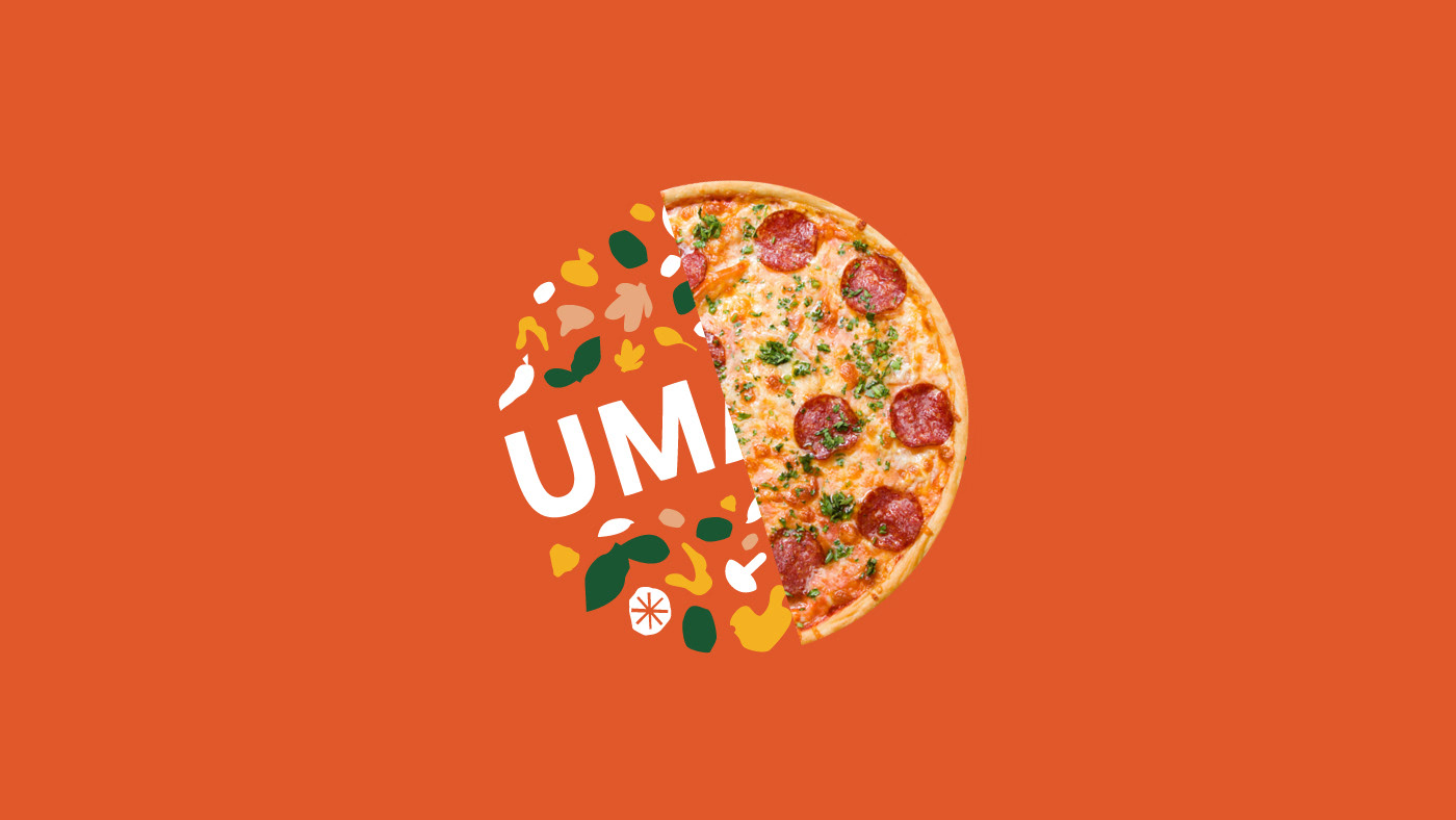
The color pallete, in combination with the ingredient shapes and friendly typography help UMAMI stand out above the others and make a statement.


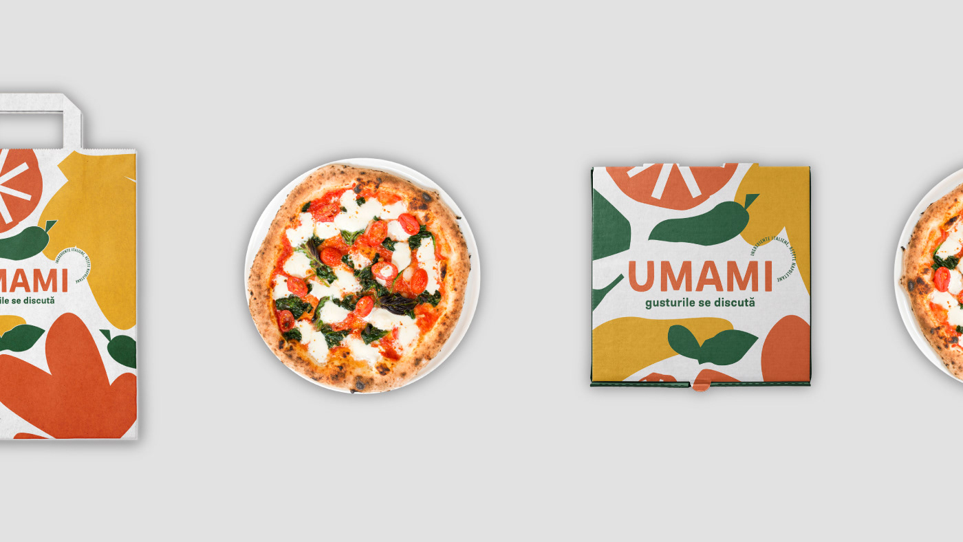
For optimal legibility, two versions of the logo were created - one to be used on full color background and one to be used on UMAMI's pattern.


If you liked the project, don't forget to press like and follow me for more work.


